Hello, I am Veri Lejeune
I love to solve complex problems and think beyond aesthetics. Design & Planning are my passions and I believe the role of design is to turn a complex problem into a simple and great solution that works for the user.
l
SURF UP
Simplifying the surfboard rental process
Project: Heuristic Evaluation & App Redesign
Company: SurfUp
Timeline: 3 months
Role: UI Designer


My role as a UI Designer
-
I have worked with Surf up to initially assess the overall user experience of their app by pinpointing flaws that could be easily solved with a better interface.
Problem
-
The app lacks a cohesive design and spatial organization.
-
According to the client's usability test, users have expressed frustration in finalizing the rental process and have not provided great feedback for the app.
Challenge
-
Determine high-priority design changes that improve the user experience, taking into account the company's limited resources.
Learnings
-
Use clear and concise messages to communicate effectively with the client.
-
Know the client's resources and constraints at each stage upfront.
-
Accessibility for mobile
Context
Surf up is a startup with the goal of simplifying the surfboard rental process by renting surfboards from an automated surfboard rental station.
To begin the rental process user needs to download their app (Surfup App) and scan a QR code on their phones.
Objectives
-
Identify usability flaws in the user interface to improve the user experience and implement incremental improvements in the user interface.
-
Articulate easy design solution - since the Startup has limited resources to work with.
Scope of Work
1) Provide a Heuristic evaluation of the app. Identify flaws that could be easily solved for the MVP, which could improve the user experience. To evaluate the app, I got hands-on myself with the product and learned it just like any user.
3) Implement a design system. Propose implementing a material design system that will ultimately improve their design patterns and consistency for anyone who picks up on this project later. Their brand identity will be much stronger with the implementation of a design system.
Heuristic Evaluation
Sign-in Page: I find it frustrating when I have to create a password while signing into a new app. This experience greatly influences a user's overall impression of the app . Beginning with difficulties is not a positive indicator.
Solution: Let users use email magic links, biometrics, or trusted logins like Apple/Google.

1

3
4
2
Flaws:
-
Did not pass color contrast accessibility.
-
The letters are too small.
-
The password is not visible, which leads to an error.
-
Password constraints display after users make a mistake.
Suggestions:
-
Maximize color contrast.
-
Increase font size.
-
Toggle Password visibility.
-
Show the password standards which need to follow while setting up the password.
Choose a surfboard: Users are being disrupted from their primary task flow by having a subscription placed in there. Additionally, these pages are hard to read and divert users' attention.
Critical: It is essential to reduce the cognitive overload of these pages by smoothing flow-task performance.
.jpg)
1
2
3

5
4

6
Flaws:
-
The logo is taking up too much space.
-
Information distracts users from their main flow. Text and color contrast did not pass accessibility standards.
-
Breaking the line creates an unnecessary orphan line.
-
Avoid presenting users with too long information.
-
Large text on the button.
-
Hard to distinguish what the image is trying to show about right and wrong.
Suggestions:
-
Minimize the navigation bar.
-
Eliminate orphan line.
-
Remove information from this page. Users need to focus on their main tasks.
-
Write short and simple sentences.
-
Shorten the information on the CTA.
-
Replace images with better quality. Remove the right and wrong signs of the images to avoid overlay and provide better clarity.
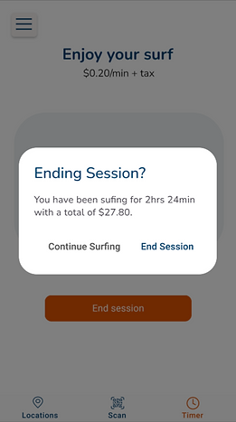
Finish up the surfboard rental: To complete the rental process, users face an overload of information presented with poor user interface design. Additionally, the process lacks steps necessary to finish the task. Hiding payment information is a critical problem.
Flaws:
-
The timer begins at 5 minutes, making it unclear for users to understand the reason behind it.
-
Overloading text information.
-
Avoid slang language like"Dude", especially when primarily meant for a male person.
-
The rental cost is too long to read. Additionally, it is missing the payment options screen. After clicking " Continue" it goes straight to the feedback screen.

1
2

4
3
Suggestions:
-
Provide a clear step-by-step process of the rental process, users will not be able to guess or remember things. On this page, one solution would be to remove the timer to display on a new screen.
-
Eliminate animation and excessive words. Make a simpler and more clear design. Replace it for a design that users are much more used to seeing in the payment process flow.
-
Collapse the information that does not need to appear up and front. Add a page for selecting payment options.
Outlined Priorities
Accessibility
Emphasized that it should be a top priority because several of the existing pages did not meet accessibility standards color contrast and font size.
?
?
Smooth-flow task performance
To improve the user interface of the app, taking into account the technical analysis, I argued that was essential to reduce the overwhelming information on some screens. That would interfere with the current user flow, which would need to be improved. I highlighted which pages are P1 such as:
- add a payment information screen to complete the flow.
App Redesign
While we haven't reached the stage of a complete app redesign, I've put together a suggestion for the app's UI below. Please note that this is an initial mock-up and has not been validated with users. However, I utilized a design system to ensure consistency throughout the design.
Splash & Onboarding pages


Sign up pages


End Rental Process


